Ag


UX
UI

NAME:
AGE:
EDUCATION:
JOB:
LOCATION
HOBBIES:
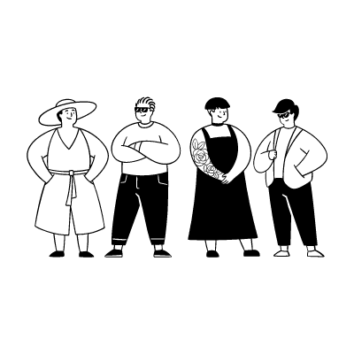
Funke is passionate about giving back to her community. She volunteers at local events and believes in the importance of helping those in need. She's tech-savvy and uses her smartphone for various tasks.
Funke hates not having timely updates about volunteering and sourcing for resources in her community.
Ag
Ag
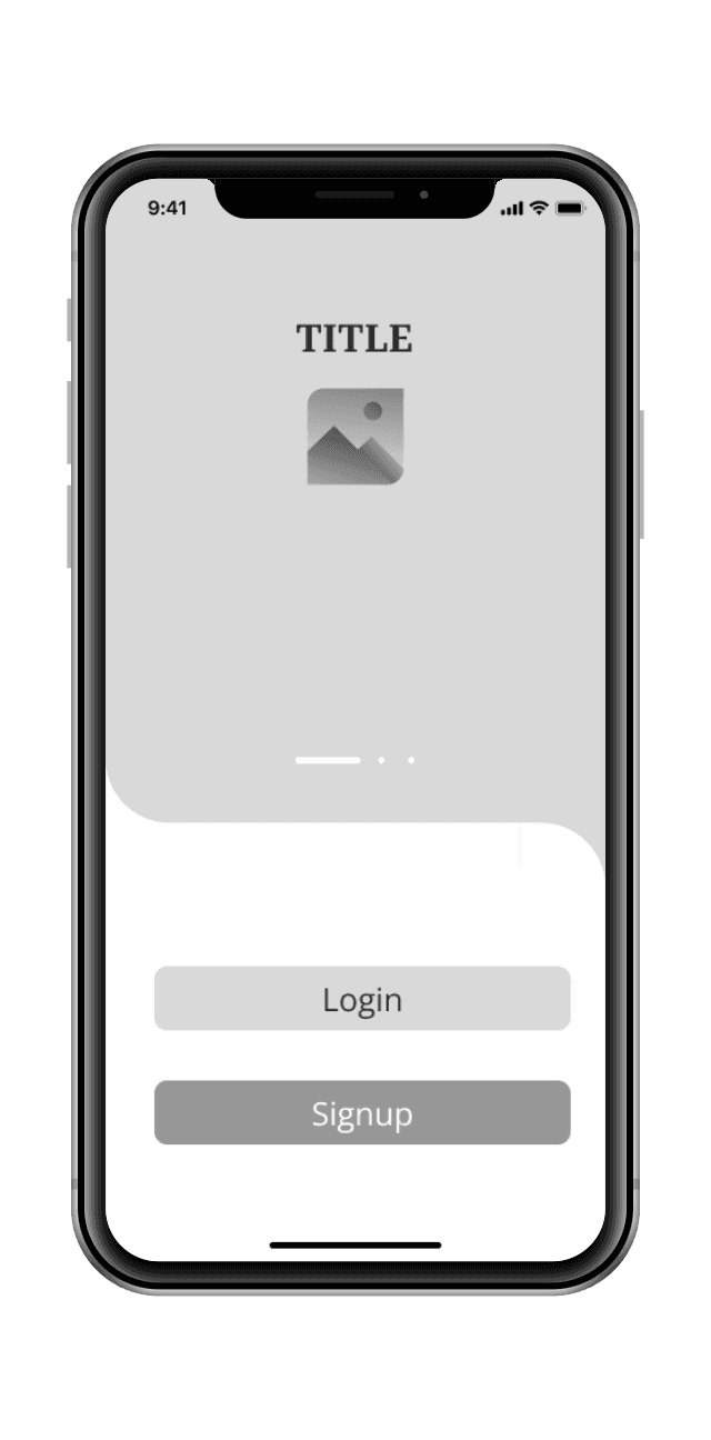
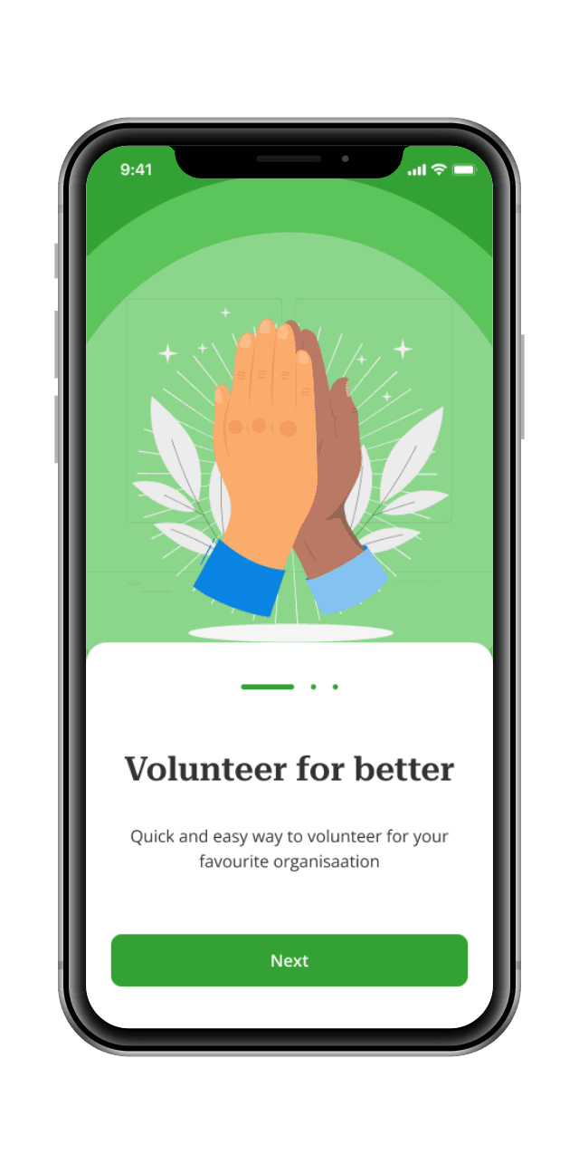
In order to proceed with the ideation phase, I laid the groundwork for a page before using visual design.
I drafted wireframes on paper, generated different versions of a page, and identified the most promising idea. Using the selected versions, I created a refined version of the homepage and proceeded to work on other key screens
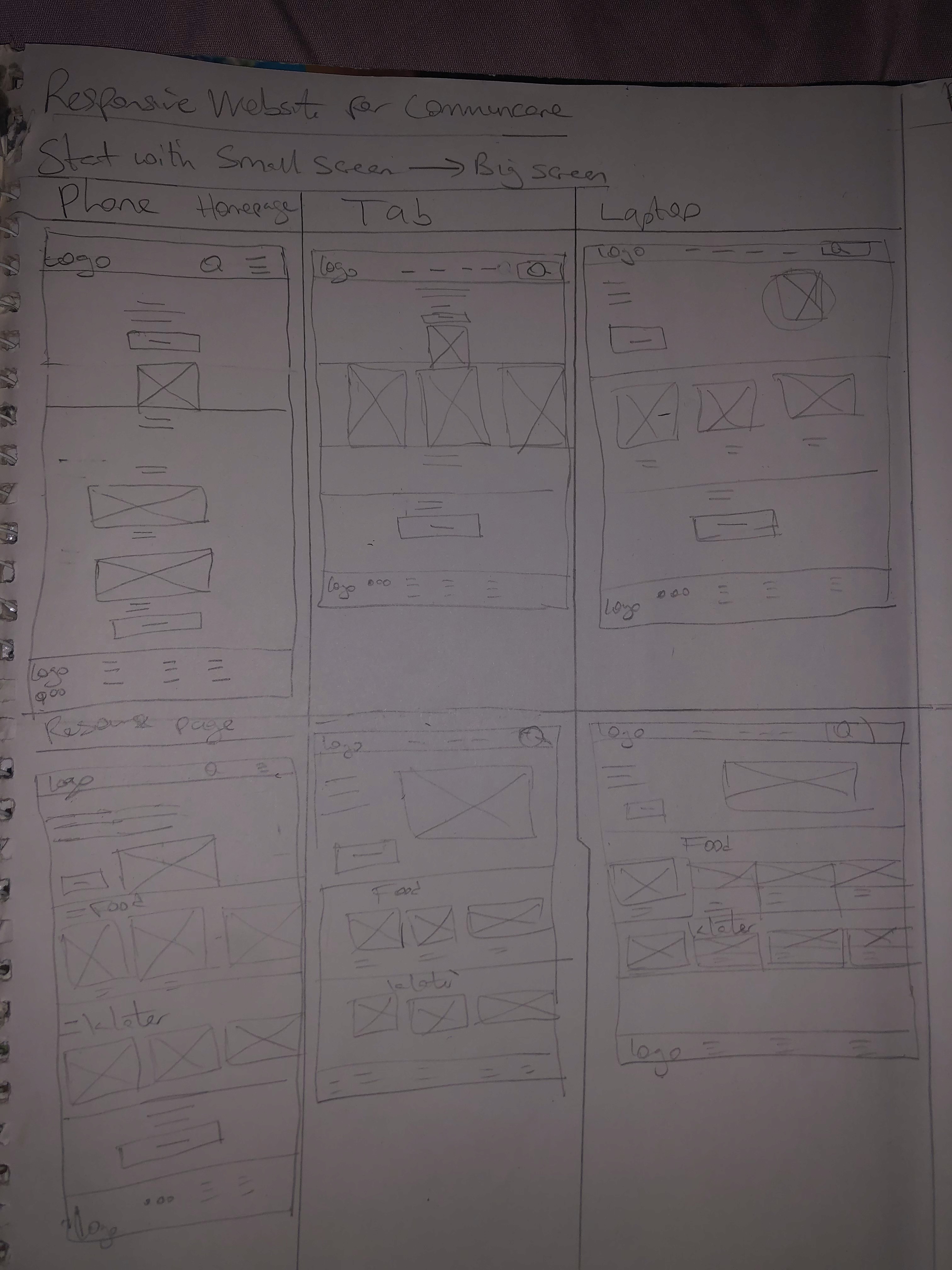
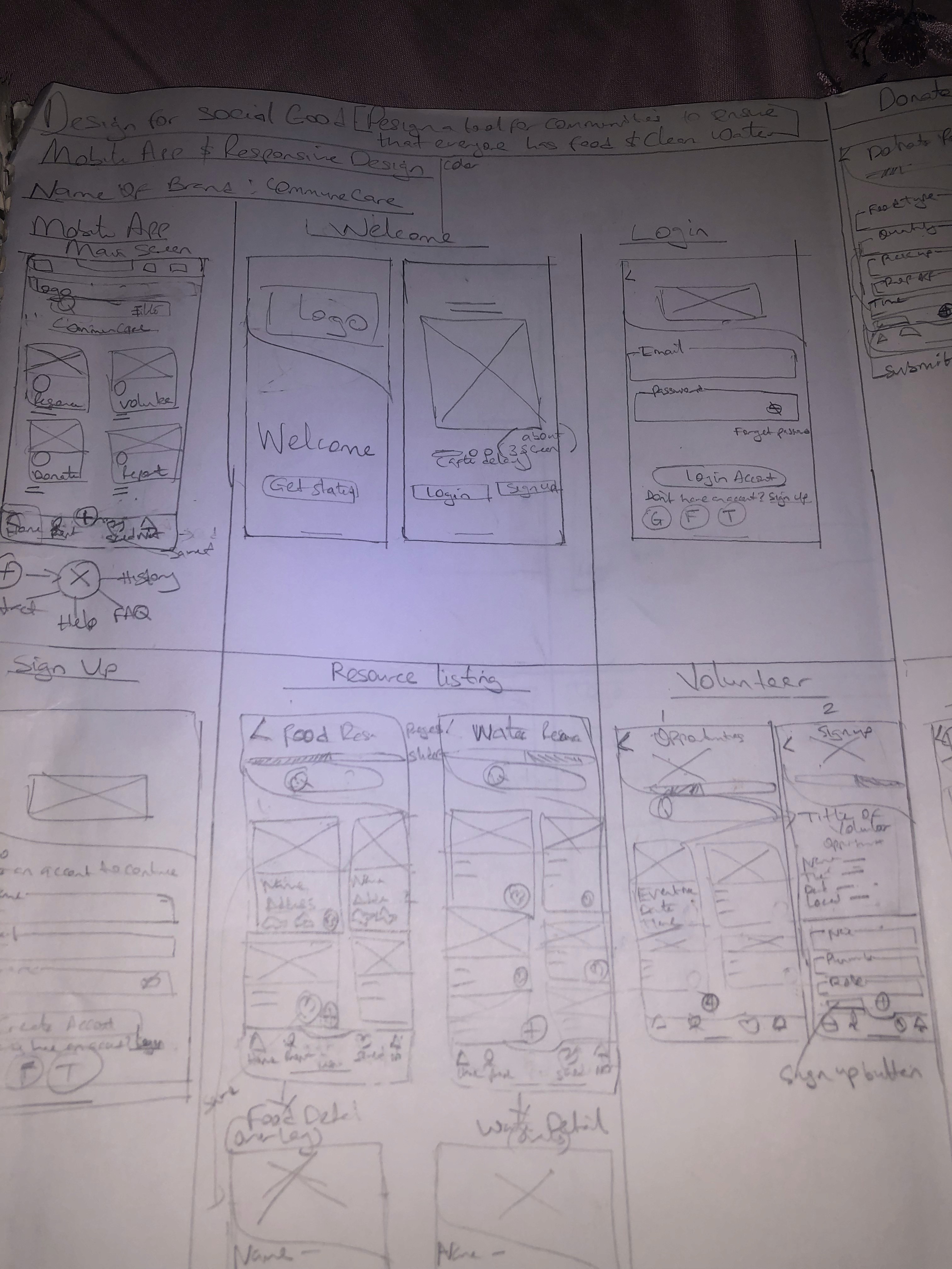
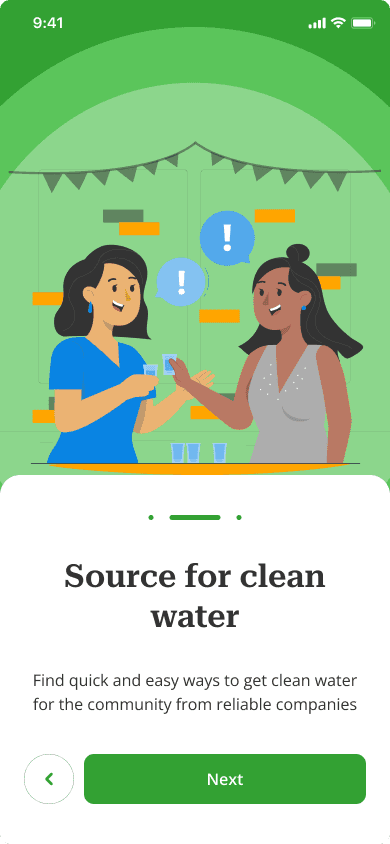
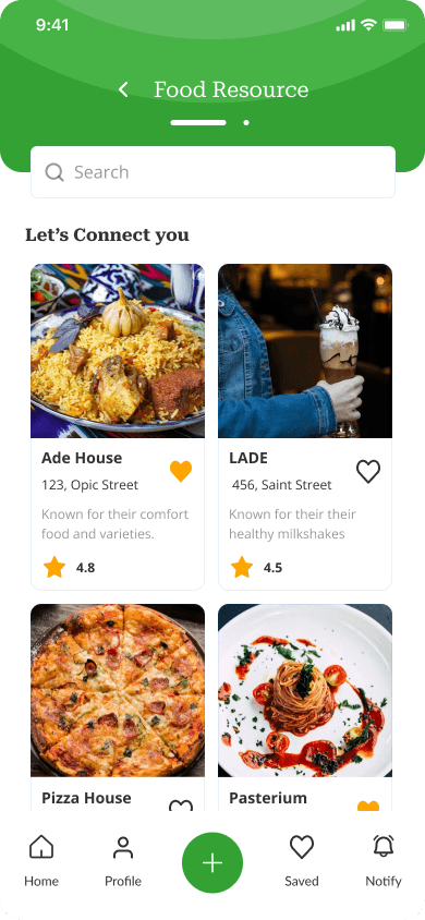
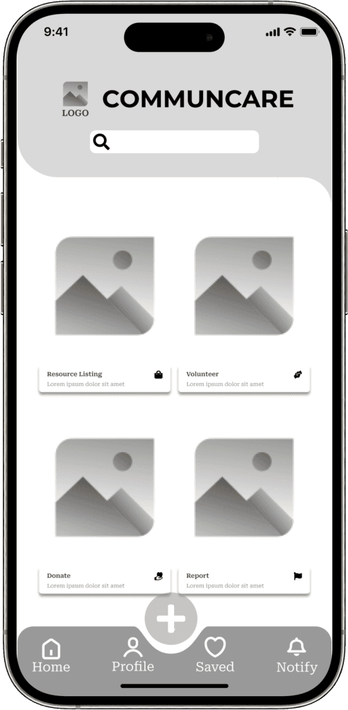
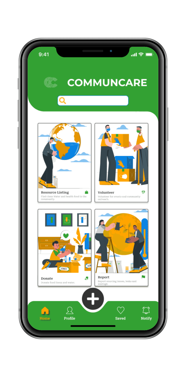
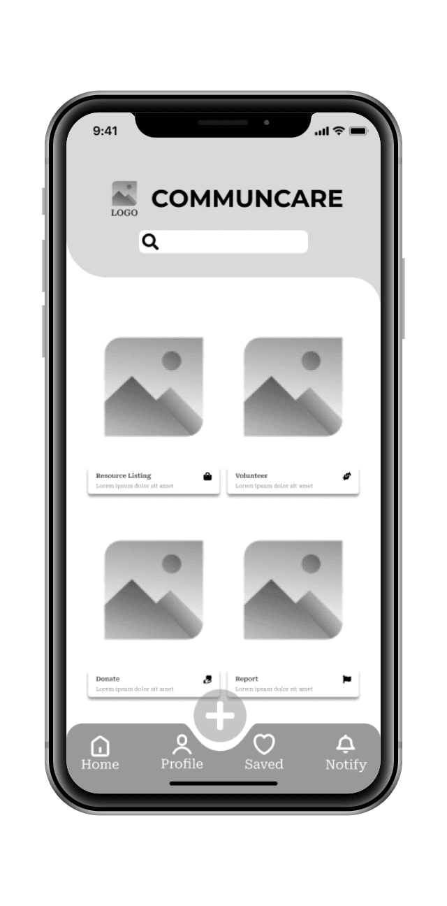
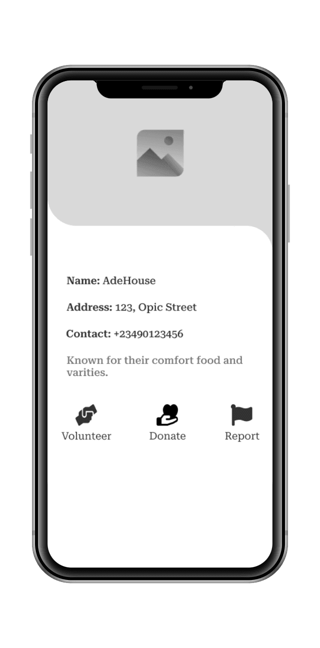
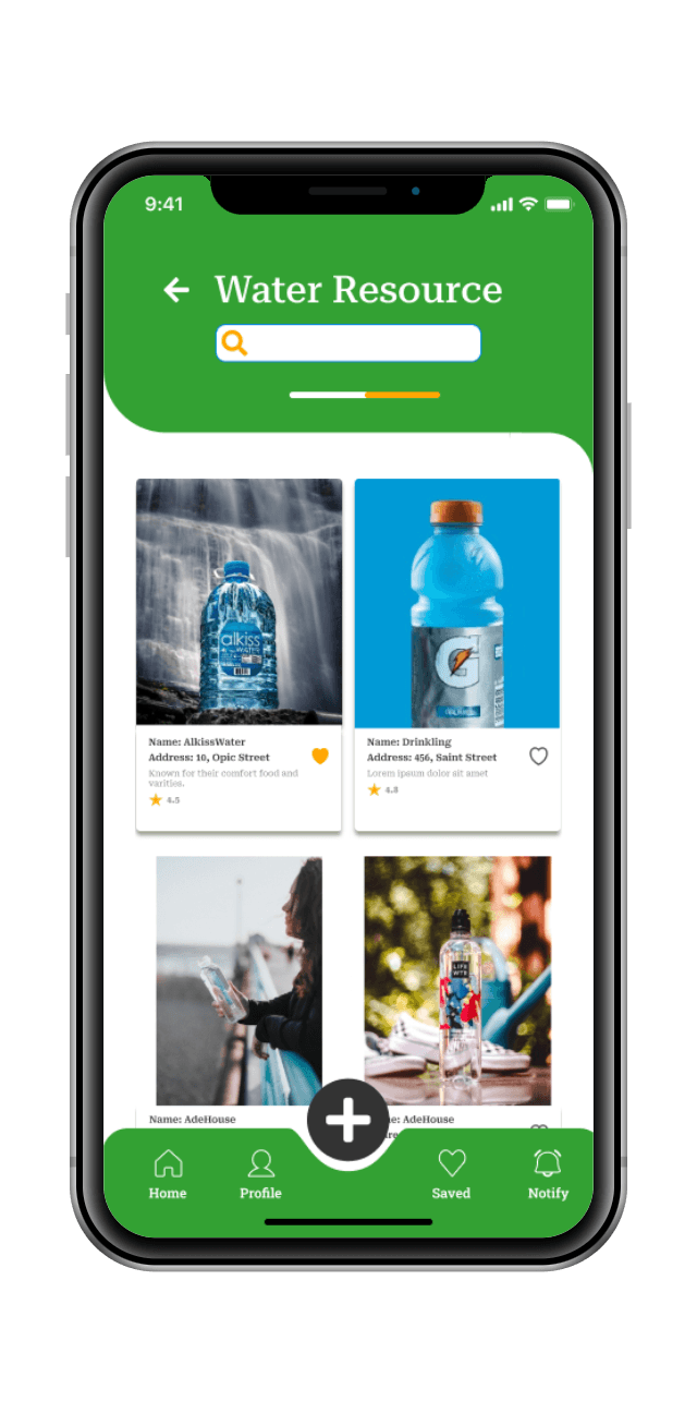
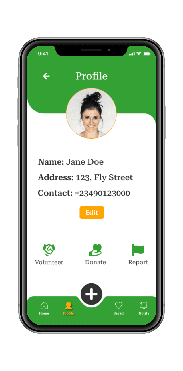
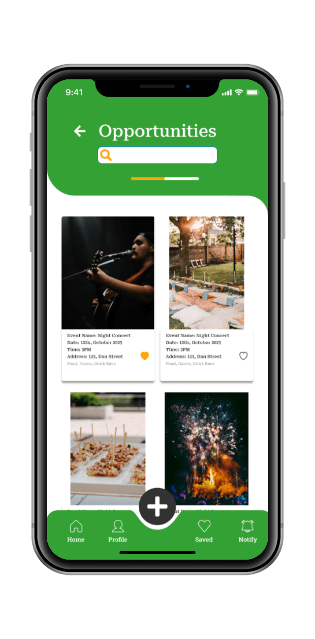
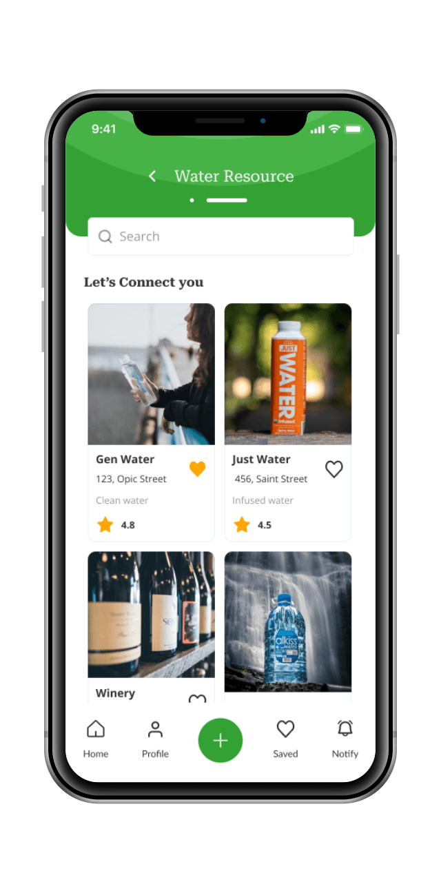
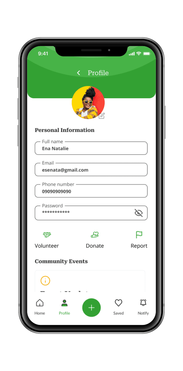
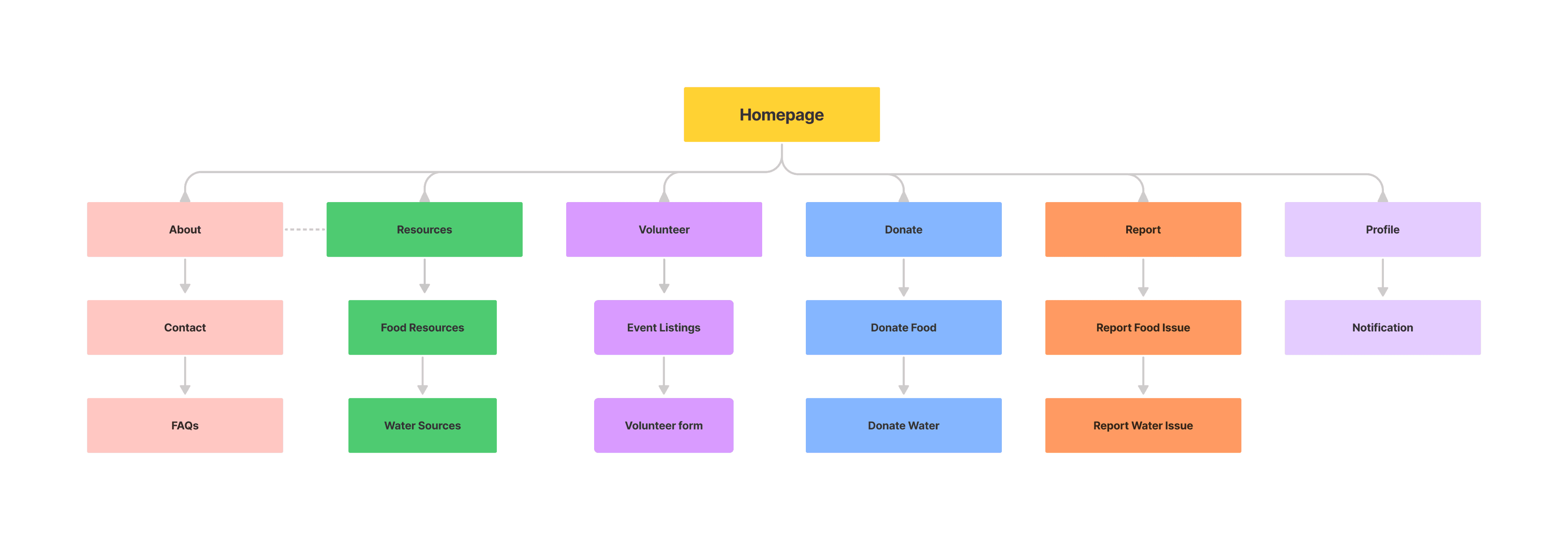
This low-fidelity wireframe represents the basic main screen for the app. Additional screens were created for the user flow, like the "Resources" section displaying listings of food and water resources, the "Volunteer" section showing volunteer opportunities, the "Donate" section with donation forms, and the "Report" section for reporting issues.
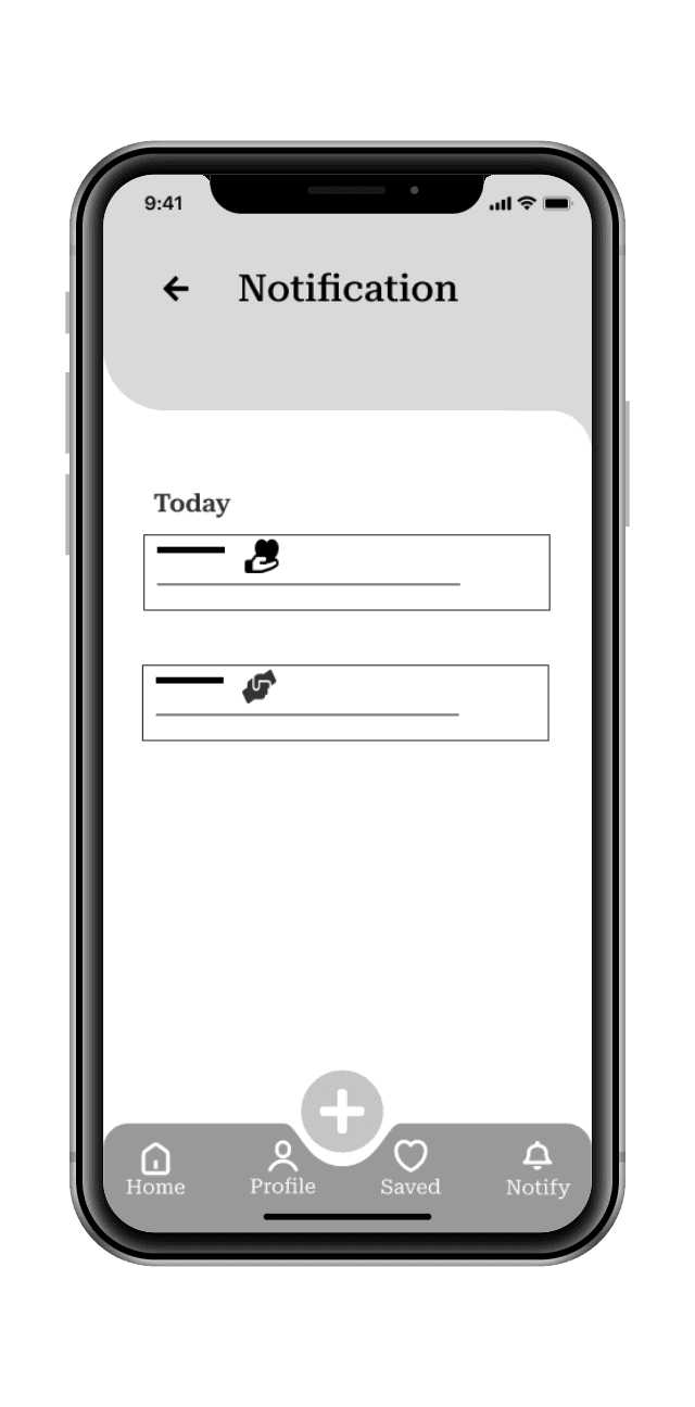
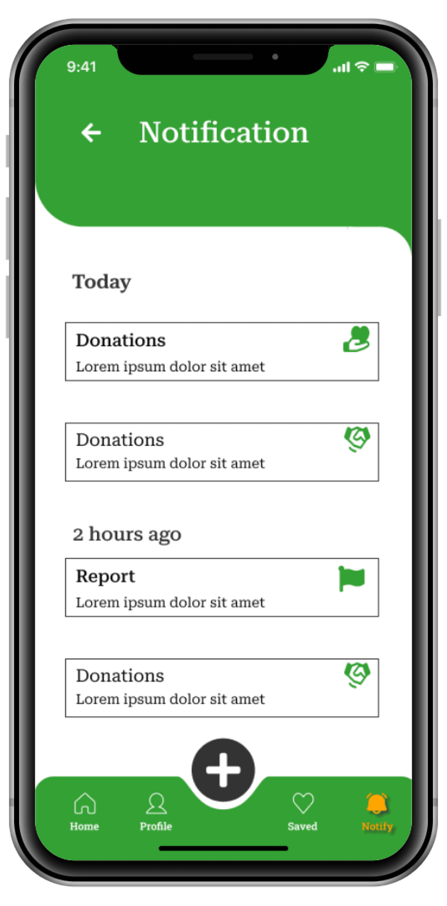
Home Screen
Other menu
Navigation bar
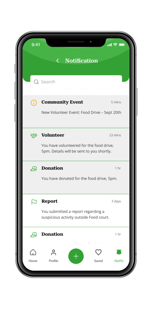
Notifications
Search bar
Listings menu
Header
Mobile users found the platform responsive and easy to navigate on smaller screens. Continue to prioritize mobile responsiveness as a crucial aspect of the user experience.
Users appreciated the clear and guided onboarding process that helped them set up their profiles and understand the platform's purpose. Continue to refine the onboarding process, emphasizing its importance for new users.
Participants with varying abilities appreciated the platform's accessibility features and inclusive design.
Continue to prioritize accessibility, ensuring the platform is usable by individuals with disabilities.
he final high-fidelity prototype presented cleaner user flows for ordering food and water through the app. It also meets user needs for a search option, donations, volunteering, and resolving issues in the community.
Listings menu
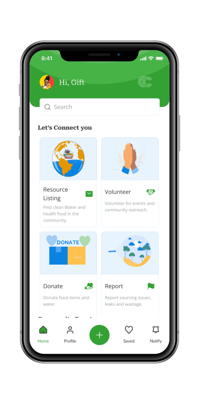
Early designs allowed for some icons, but after the usability studies, I added accessible icons for easy Navigation and accessibility. I also revised the design so users see all the icons when they first land on the screen. I also added a search function to the page. Over time, new version of the app was also created.

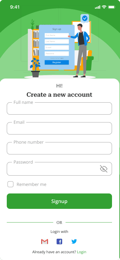
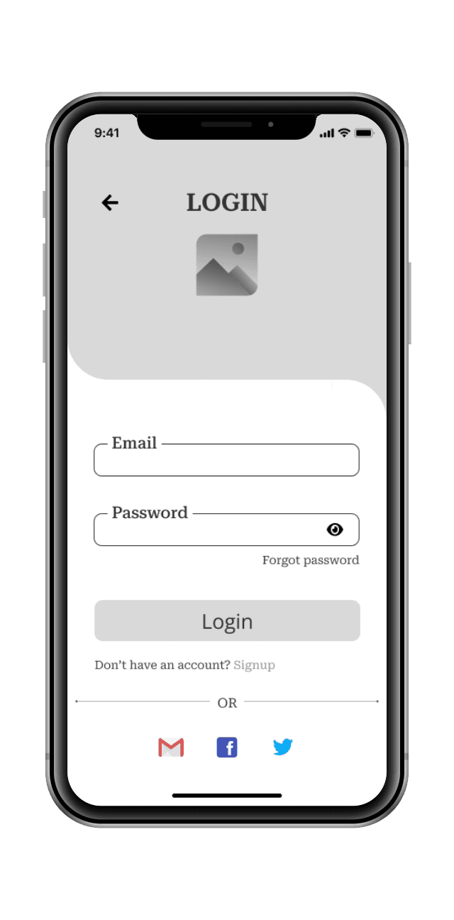
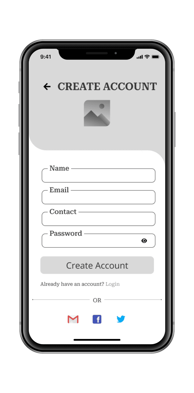
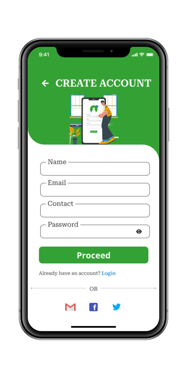
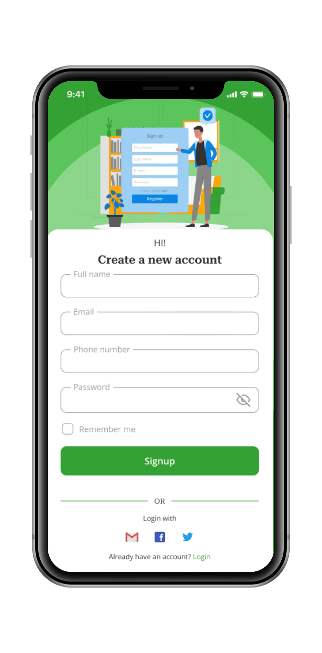
Signup
Signup

Resource Listing
Find clean Water and health food in the community.

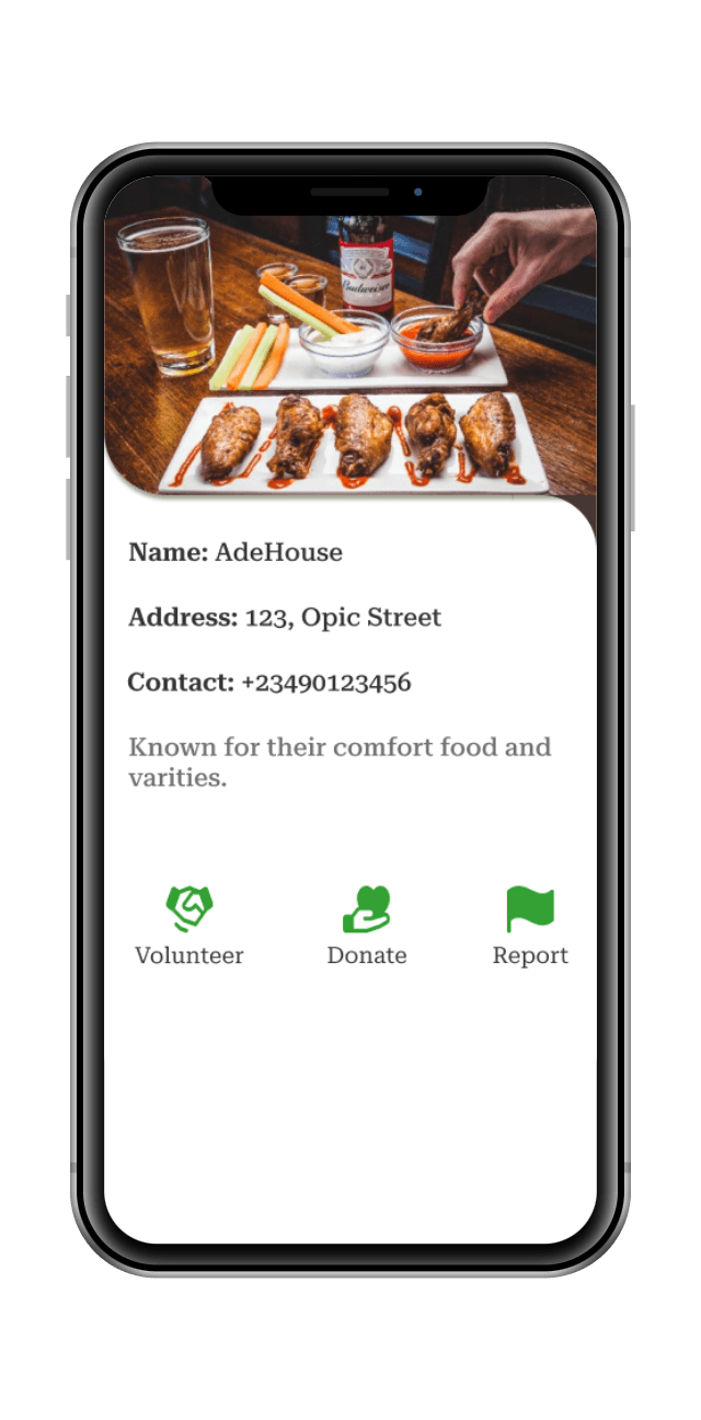
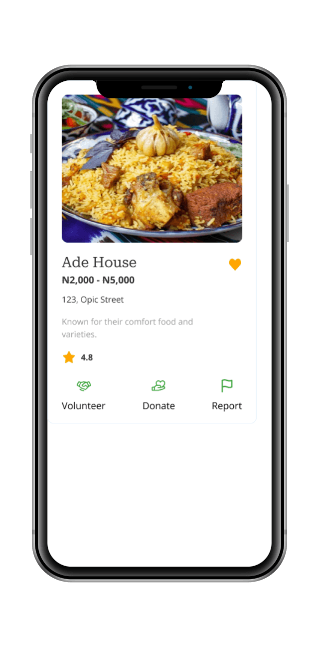
Ade House
N2,000 - N5,000
123, Opic Street
Known for their comfort food and varieties.
4.8
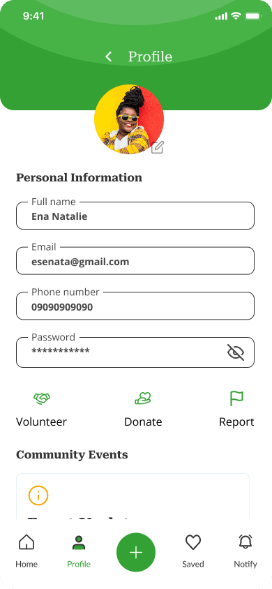
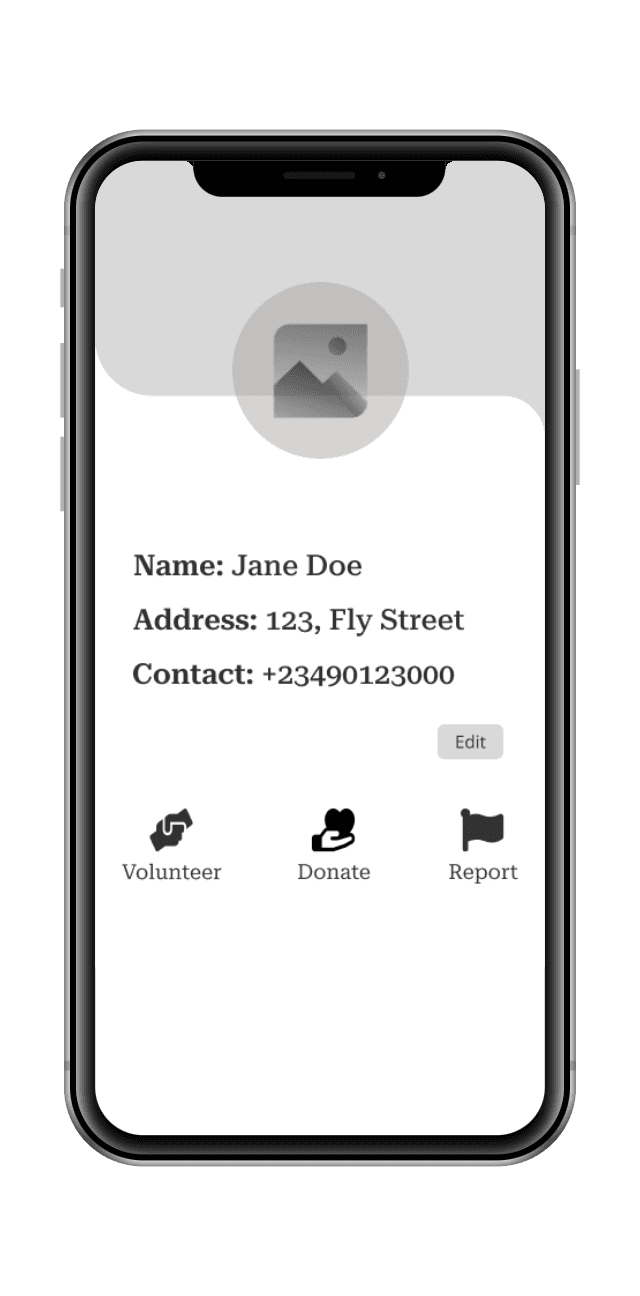
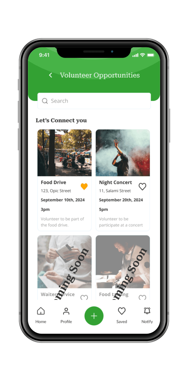
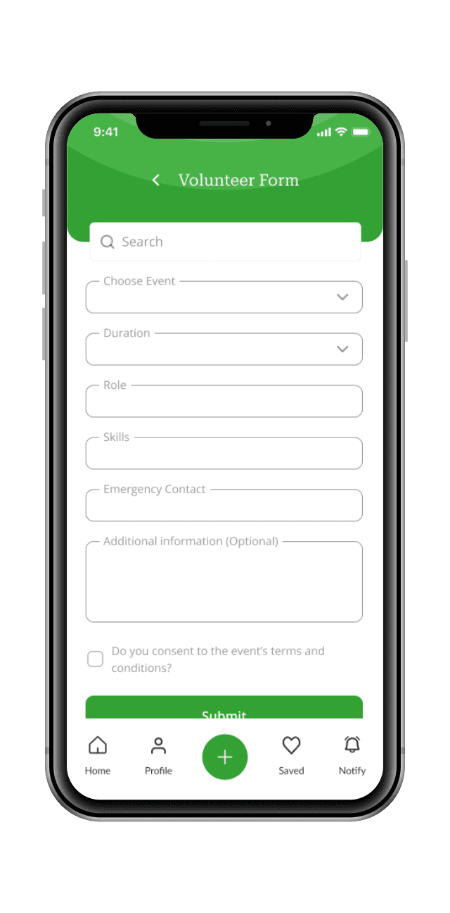
Volunteer
Donate
Report
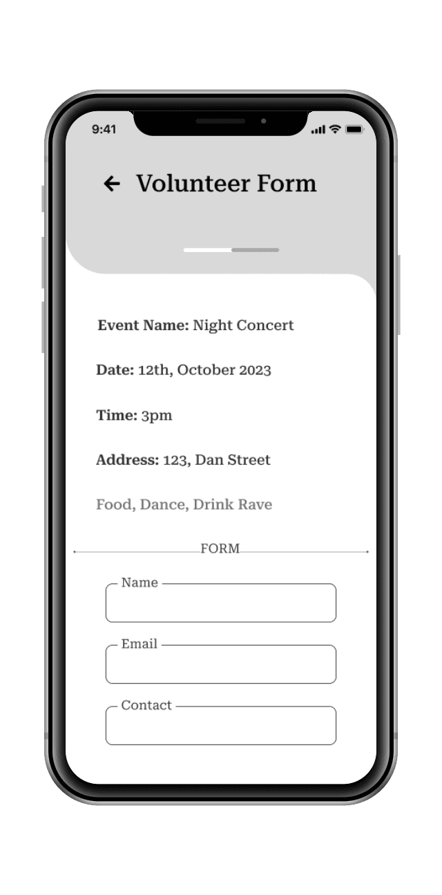
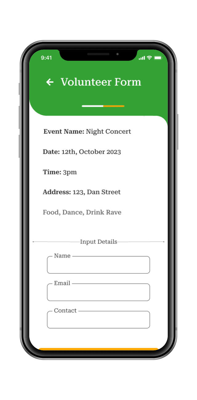
Food Drive
123, Opic Street
September 10th, 2024
3pm
Volunteer to be part of the food drive.
Waiter service
11, Salami Street
November 10th, 2024
5pm
Volunteer to be a waiter
Coming Soon
Full name
Phone number
Password
Full name
Phone number
Password
Home
Profile
Saved
Notify
Search
Consideration: Ensure that all aspects of the app and website are compatible with screen readers commonly used by individuals with visual impairments.
Action: Use semantic HTML elements, provide meaningful alt text for images, and ensure that screen readers can properly interpret and navigate through the content and user interface components.
Consideration: Address color and contrast issues to make content readable for users with visual impairments or color blindness.
Action: Choose color combinations that provide sufficient contrast, especially for text elements. Avoid relying solely on color to convey information and use other visual cues such as patterns or icons to supplement color-coded content.
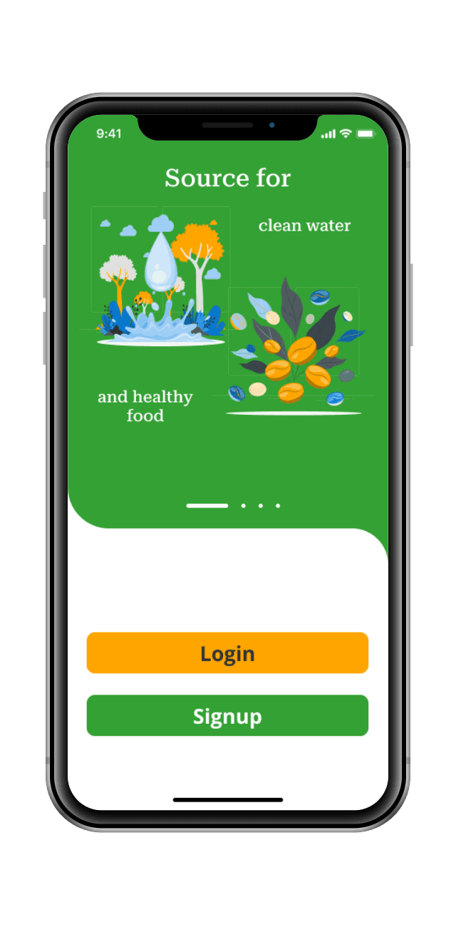
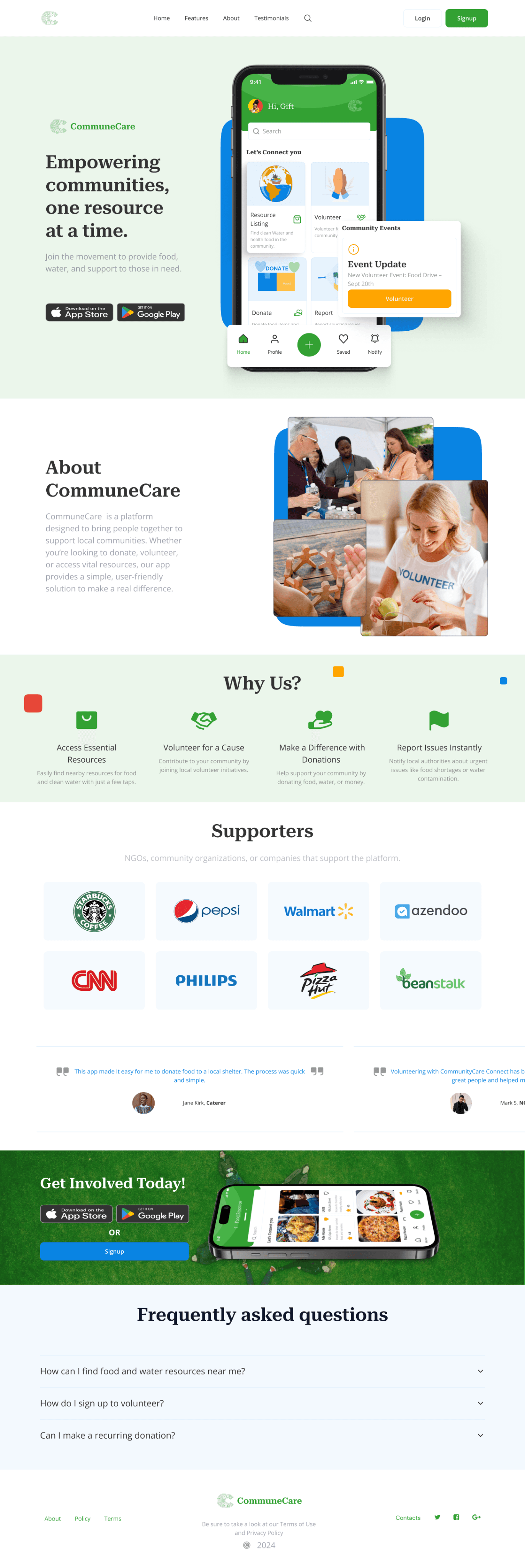
Highlights the app’s mission to help communities access food and clean water, with a call-to-action button encouraging users to download the app or sign up.
Briefly introduces the app’s goal to connect communities and empower users to make a difference.
Explains key features like resource finding, volunteering, donations, and issue reporting with supporting visuals.
Showcases positive user feedback to build trust and encourage new users to get involved.
Positioned throughout the page, prompting users to volunteer, donate, or report issues.
Creating a sitemap for the CommuneCare landing page design is essential for visualizing the app's structure and navigation hierarchy.
The landing page is clean and user-friendly, with clear navigation to ensure visitors understand the app’s impact and how to get started.

The designs for CommuneCare made a significant impact on our community, fostering unity, ease of resource access, and a sense of collective purpose.
Society and community start with an individual who wants to grow and make an impact on the lives of those around them.

